I'm a Designer. How should my ClearVoice Portfolio look?
A curated portfolio example of a vetted designer
If you’re an established (or aspiring) designer, you may have some questions on how to best set up your CV portfolio to fit what clients will be looking for. Take a look at the freelancer portfolio below as well as the best practices in setting up your design portfolio.

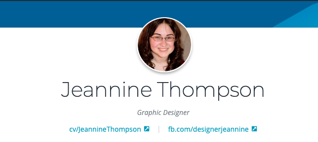
Meet Jeannine Thompson. Jeannine is a successful ClearVoice creative who works with a number of clients in our network. She has done more than a few things right in setting up her CV to showcase past works and expertise. Here’s just a bit of what sets her apart:
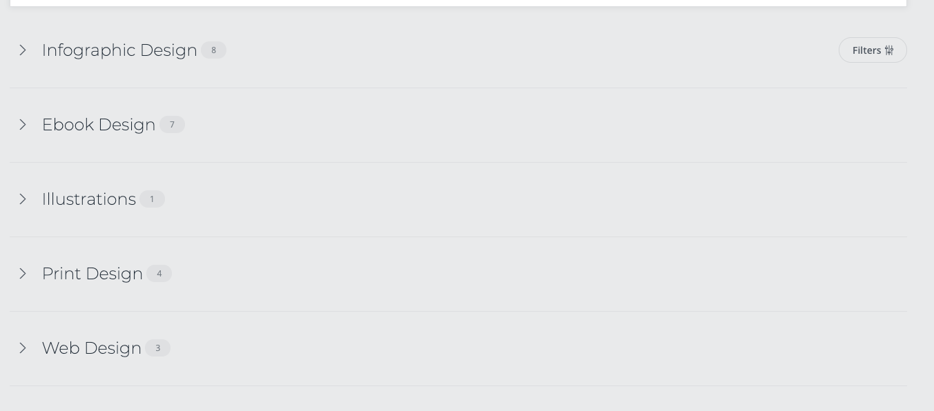
Work is sectioned by Content Type
Clients want to know exactly what you can offer. Jeannine has set up a number of sections with different content types (Ebook design, Illustrations, Infographics etc). Showcasing the different pieces you have worked on in a categorized way makes for higher credibility in your CV overall.


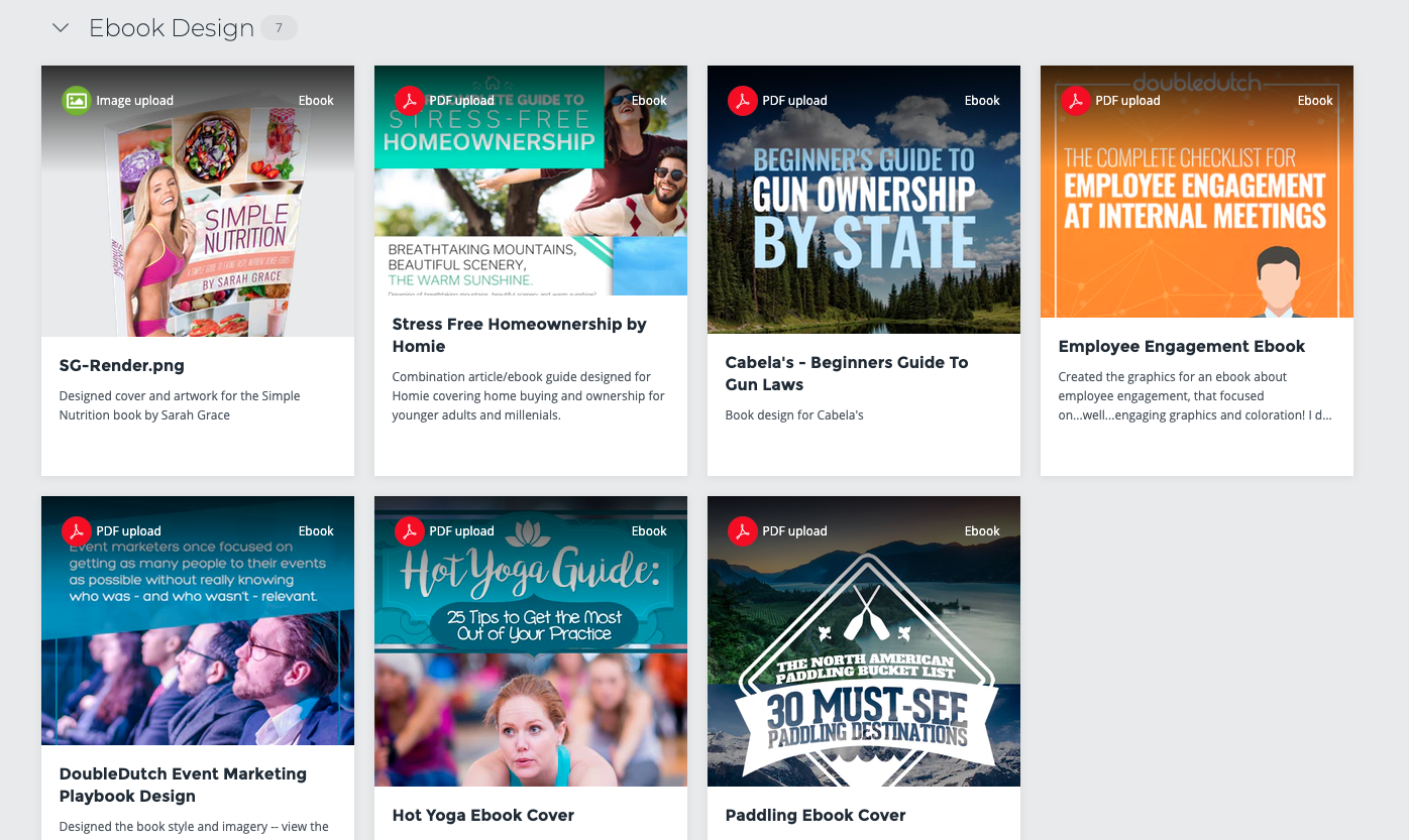
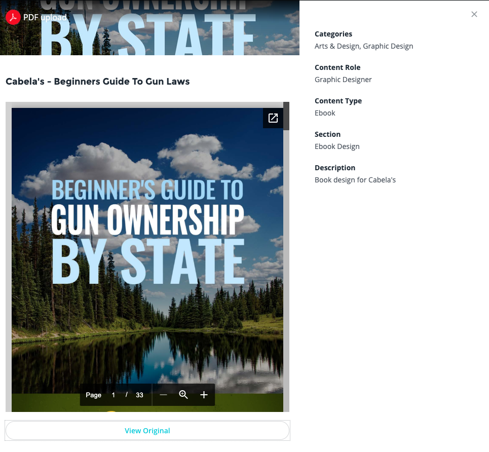
Content is uploaded in a visually appealing way
Jeannine does a great job of providing the specific design in the most original format. Some uploads or screenshots of work diminish the original work, and from a client’s perspective, this is an immediate red flag. Work to upload your content in a way that is appealing and easy to view.

Expertise is Explained
On top of Jeannine’s content pieces, she also goes into detail the past experience she’s had as a designer. Your CV bio is a great place to articulate these three things:
-
- Design platform(s) you use
- Past clients you've worked with (pending their permission)
- Content types you've designed/are most comfortable with

Curating a CV Portfolio like Jeannine’s can be extremely helpful in winning more work. Best of luck with your portfolio updates and always feel free to reach out using the chat below!